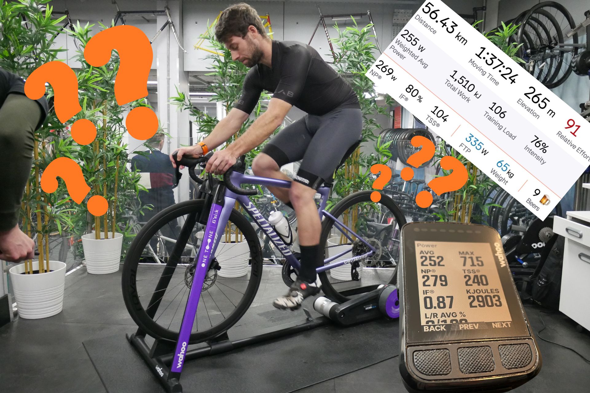
So far in ‘An Introductory Guide to Power’ we have covered how to pick the right power meter for you and how to get started with power testing. Once your ride is uploaded to wherever you manage your recorded activities you will immediately be met with more acronyms, scores, and results than you’ll know what to do with. Along with average and maximum power, there is a whole range of other metrics that help break down your performance from session to session.
These scores, graphical displays and percentages aren't just jargon; they help you compare your performance from ride to ride. When viewed together in the context of your chronic training (applications like Training Peaks refer to your long-term training load as your chronic training load or CTL) they can also help inform and guide your training to be as effective as possible. It can take a little while to relate to what the numbers mean but before you know it you’ll be able to extract everything you want to understand from a ride after looking at your uploaded data for less than a minute.
What is Normalised power?
Normalised power (NP) is a metric used in cycling to estimate the physiological cost of a ride more accurately than average power. For highly variable rides such as a typical group ride or hilly route where you might spend some time well above your threshold and some time far below it, normalised power is a better gauge of the ‘effective’ power of the ride. This is because a two-hour ride at a flat 200 watts would have the same average power value as a ride that alternates between 30 seconds at 350 watts and 30 seconds at 50 watts, even though the latter would be considerably more taxing.
Normalised power differs from average power in a few key ways. Firstly, it takes into consideration the variability of the ride. Let's compare two rides, one with steady power like a time trial and another with frequent spikes and lulls in power like a hotdog criterium. While both might have the same average power, that mathematical equivalence doesn’t consider the physiological cost of repeatedly exceeding your threshold. In this example, the criterium race would have a higher normalised power than the time trial even though the two efforts could both have the same average power.
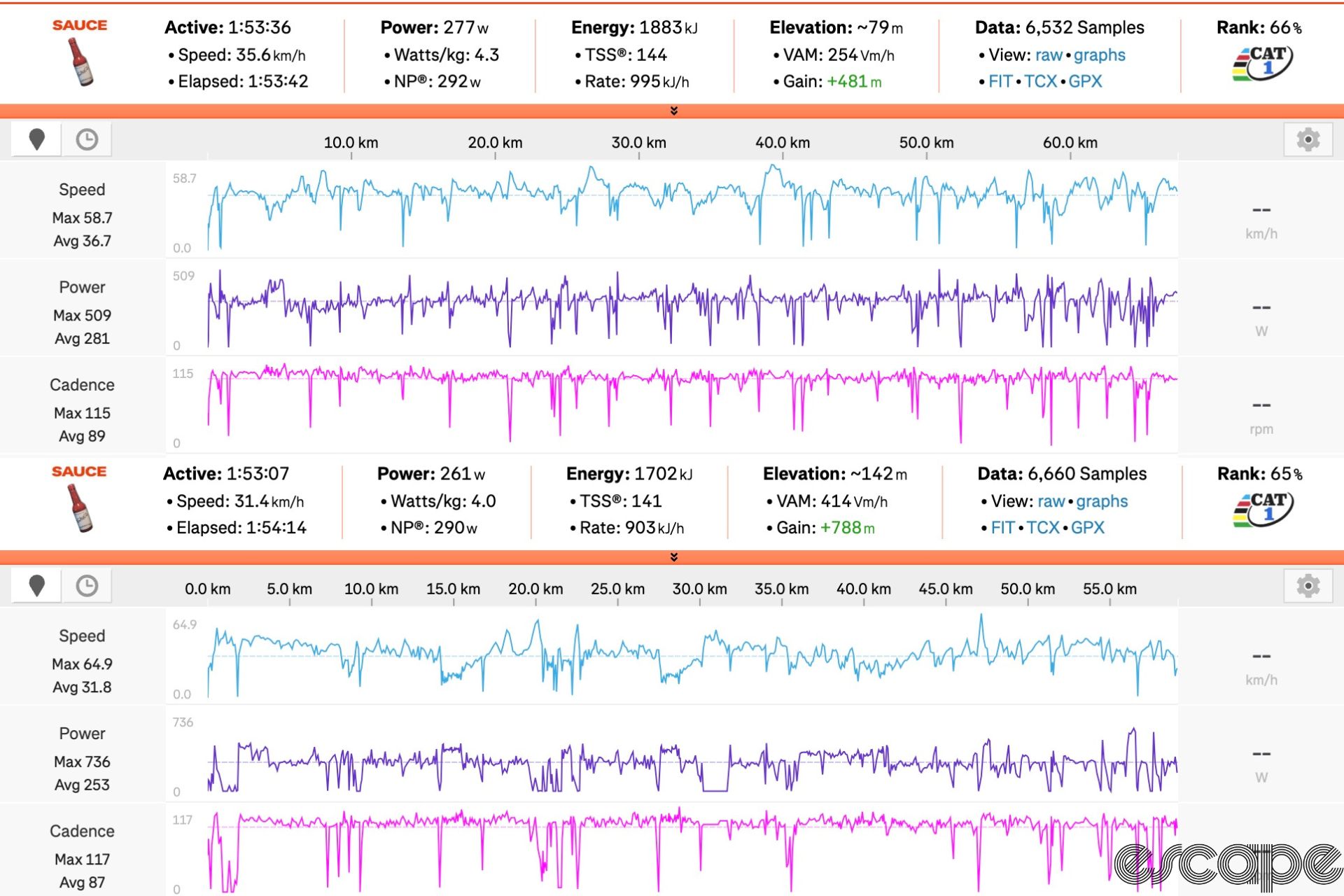
Normalised power applies a 30-second rolling average that smooths out the spikes and dips in power. This has the benefit of taking into consideration the body’s response after an effort, especially those short high-power spikes. Although a sprint may last around 10 seconds the effect of the sprint will be felt for considerably longer than this. These 30 second rolling averages are then raised to the fourth power, where an overall average is taken before the fouth root of this figure is calculated giving a NP value.
Finally, normalised power is a better reflection of the effort of a ride. Unless you ride on an indoor trainer or ride exclusively on very flat roads there will be big swings in power as the terrain you are riding changes. These big swings in power make it more fatiguing to reach a certain average power than if you were to ride at a consistent steady intensity. Normalised power gives a more accurate representation of the actual physical demand of a ride, making it a better tool for tracking effort, especially in variable conditions.
How does intensity factor fit into the mix?
Another metric that you will see on your head unit or in an analysis suite is something called intensity factor, abbreviated as IF. This is a calculation of how intense your ride was in comparison to your functional threshold power (FTP). It provides insight into how hard a ride was, relative to yourself.
Intensity factor is simply the normalised power from your ride divided by your FTP. This means that in short efforts or highly variable rides, it is possible to attain an intensity factor greater than 1.
- IF = 1.0: This means you rode at exactly your FTP (as shown by NP) for the duration of the workout.
- IF > 1.0: Indicates an effort harder than your FTP. This can be common in crit races, time trials, or short, intense interval sessions.
- IF < 1.0: Represents a ride at less than your FTP. The bulk of rides will sit in this band and this is common for longer endurance rides.
Although most of your training is likely to sit in the <1.0 band the specific intensity factor can easily give a broad indication of how intense the ride was.
- IF = 0.50-0.65: Recovery ride or very easy endurance ride.
- IF = 0.65-0.75: Steady endurance ride, typically long-distance efforts at moderate intensity.
- IF = 0.75-0.85: Tempo ride, building aerobic endurance, moderately hard.
- IF = 0.85-0.95: Threshold and more intense rides, like a time trial or hard training session.
- IF = 1.0 or above: Very intense effort, indicating hard intervals or races, above threshold level.
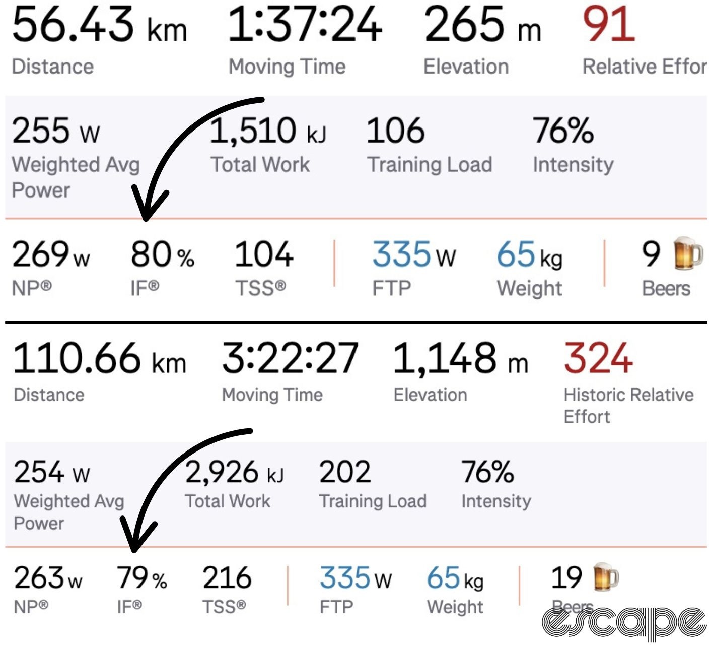
The issue with the intensity factor is that it doesn’t consider duration so an hour's ride at 300 watts would have the same intensity factor as a four-hour ride at 300 watts.
Training stress score (TSS)
That's where training stress score (TSS) comes in. TSS is used to quantify the total load of a ride factoring in a rider's FTP, normalised power, and the duration of the ride. First formulated by the duo of Dr Andy Coggan and Hunter Allen, this metric allows for different-intensity rides to be compared. Fundamentally it adds the duration component to a ride’s intensity factor to give a fuller perspective on the physiological cost of a session.
A long low-intensity ride could yield the same TSS as a short interval session because although the intensities are wildly different the durations balance the score. TSS combines the intensity and duration of a ride to estimate how much physical stress the ride places on your body. TSS can be incredibly helpful for tracking training load, measuring fatigue, and monitoring recovery.
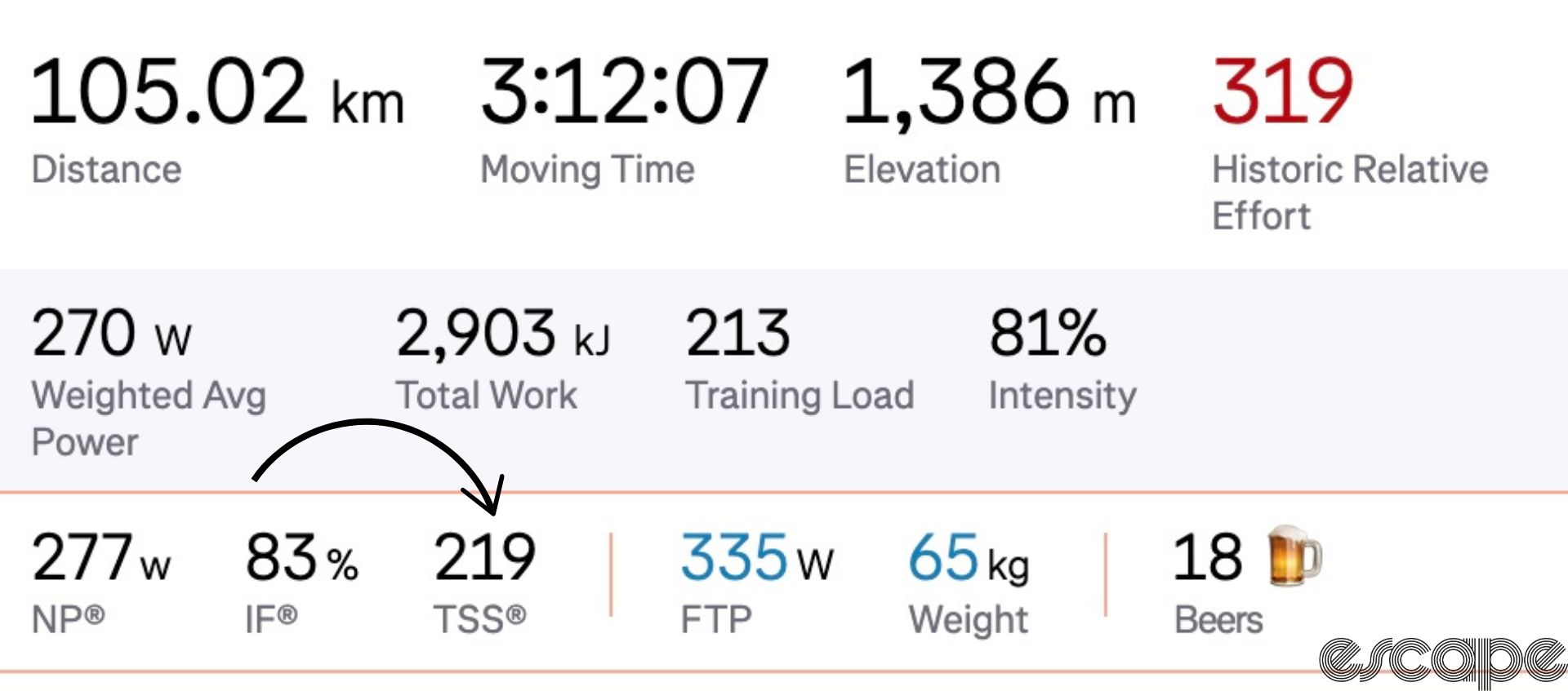
TSS = (Duration in hours) × (Normalized Power / FTP)² × 100
As TSS is a score based on your own ability it is possible to generally categorise scores into bands. To start with a reference point, a TSS of 100 would be equivalent to one hour of steady-state riding at FTP.
- 0-50 TSS: Low-intensity ride, light recovery effort.
- 50-100 TSS: Moderately intense ride, often a short, steady endurance session.
- 100-150 TSS: Challenging ride, typically 1-2 hours at or near FTP.
- 150-300+ TSS: Hard, long ride or intense interval session, requires significant recovery afterwards.
High TSS values accumulated over several days or weeks indicate a large uptake in training stress. Knowing how much stress you have amassed and how much your body can tolerate before needing some recovery time helps to create tailored training plans. Tracking TSS over time is a beneficial way to monitor the progress of your training without heading into a state of overtraining. Progressively building your training load to a higher total TSS over weeks allows for a steady and measured increase rather than overdoing it with a sudden jump that leaves you fatigued and needing to take a longer period off the bike to recover.
Pedal Centre Offset (PCO)
This is a metric that only users of dual-sided power pedals have access to and isn’t one that immediately springs to mind. Pedal centre offset (PCO) measures where on the lateral axis of the pedal axle force is applied. Values are typically given in millimetres with a positive value indicating force towards the outboard side of the pedal and a negative value towards the inboard. It is best viewed through the power meter's own app as some platforms like Strava will not show your PCO as a standard metric.
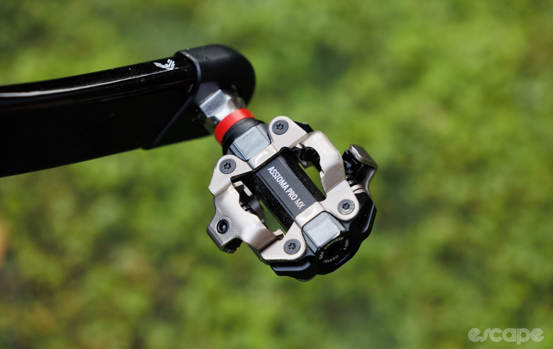
Shane Miller (better known as GPLama on YouTube) is a big fan of this metric and how it can reveal poor form or bike fit. “We've got pedal smoothness and torque effectiveness,” he says. “No one really uses that. We've got peak power phase but that’s going to change depending on if you are going downhill or uphill. PCO is an interesting metric because if you're not balanced on the pedals, that's some efficiency loss you're looking at. I found the other day that when I'm going super hard, my PCO goes all the way out so I'm losing form. I can use PCO to see I'm losing form when I'm going hard.”
Beyond in-ride data, PCO can also be a useful tool for bike fitting. Knowing where on the pedal you are applying force can allow for corrective measures such as insoles, longer pedal axles, and changes in cleat positioning. This is typically the reserve for a professional bike fitter as there are lots of considerations around the rider's anatomy and bike configuration that all feed into the best setup.
Understanding your power profile
Most training analysis tools will show a power curve based on your best efforts for a given duration. Understanding your power curve can help you better understand your strengths and weaknesses as a rider as well as what type of rider you are.
When looking at a power curve the x-axis represents time, typically starting at three seconds and extending as far as your longest ride or a selected window or duration. The y-axis represents your power output either in watts or in watts-per-kilo depending on which you prefer to use.
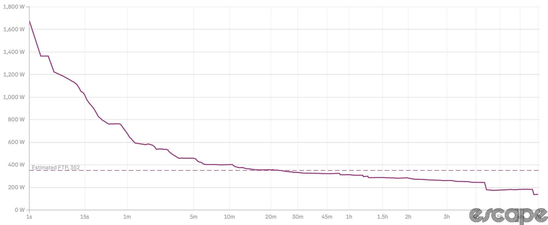
In some respects, this looks very similar to a critical power graph however instead of the graph creating a trend line based on a few given test points it displays your actual best efforts over your selected time frame. This allows you to consolidate more ride data across a spread of rides to map out your performance characteristics on the bike.
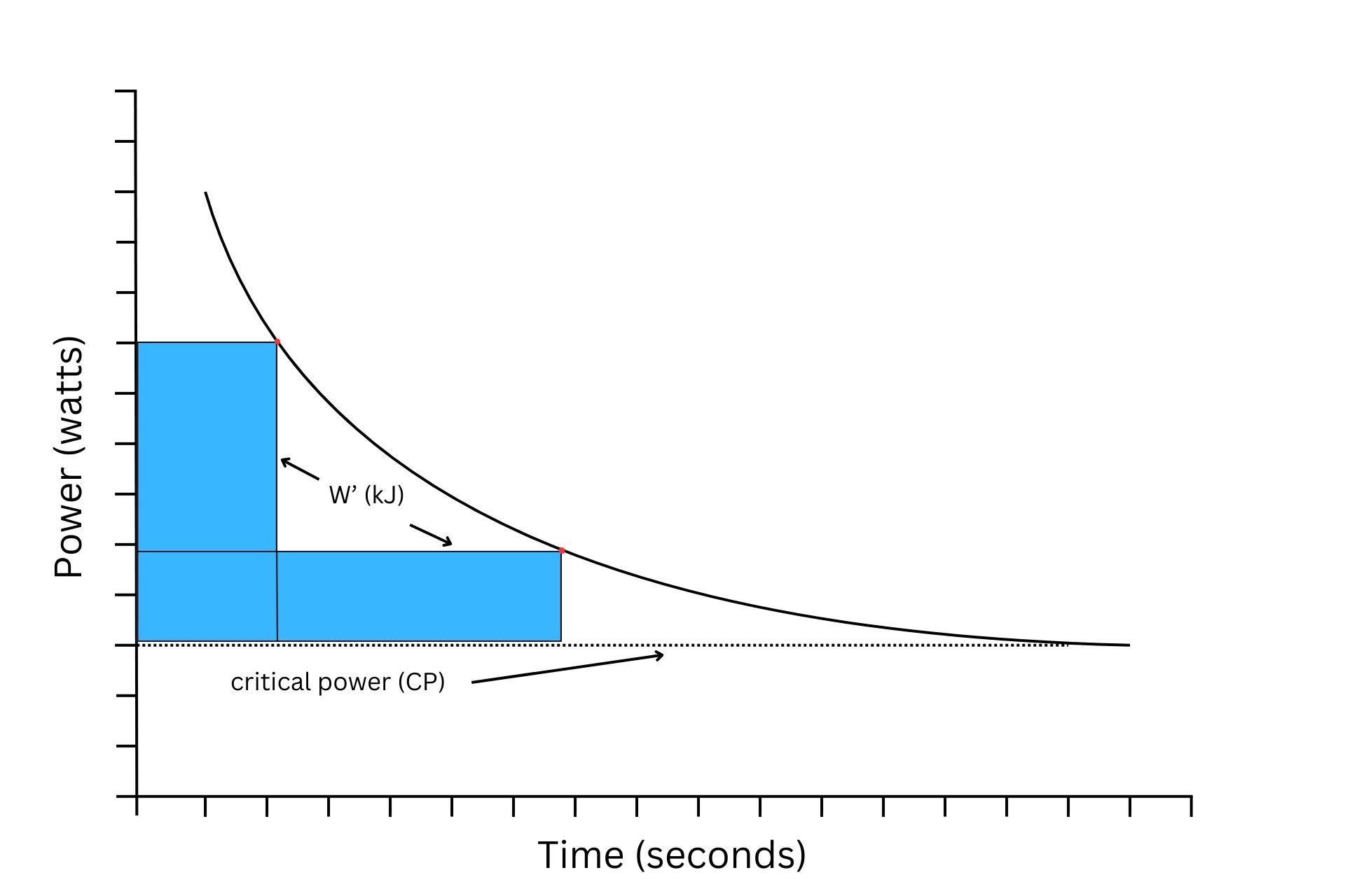
Unlike a critical power curve that follows a smooth exponential curve, you will find that some riders will have profiles that deviate from the smooth curve with either dips or humps that can be used to characterise the type of rider they are. Sprinters and puncheurs will have a high initial output that will slowly drop off before reaching a certain point where it will then drop quickly when they reach the limits of their anaerobic ceiling. Time trialists or riders with a more diesel-engine style might have a very sharp drop-off before it settles and flattens out for durations lasting 20 minutes or more.
Every rider's trend will be broadly the same, starting on the left as the high point. The rate at which the curve drops will depend on your peak sprint power and your maximal anaerobic power production. Riders with a higher anaerobic ability will see their curves drop off slower than a rider who is more endurance-focused. Once you get to the 20-minute mark the drop-off of the power curve is less pronounced, however the drop-off is still a useful metric. If you find that your maximum power over 30 minutes is not all that dissimilar from 90 minutes it could signify a big aerobic engine whilst a big drop from 20 minutes to one hour could indicate a lack of endurance.
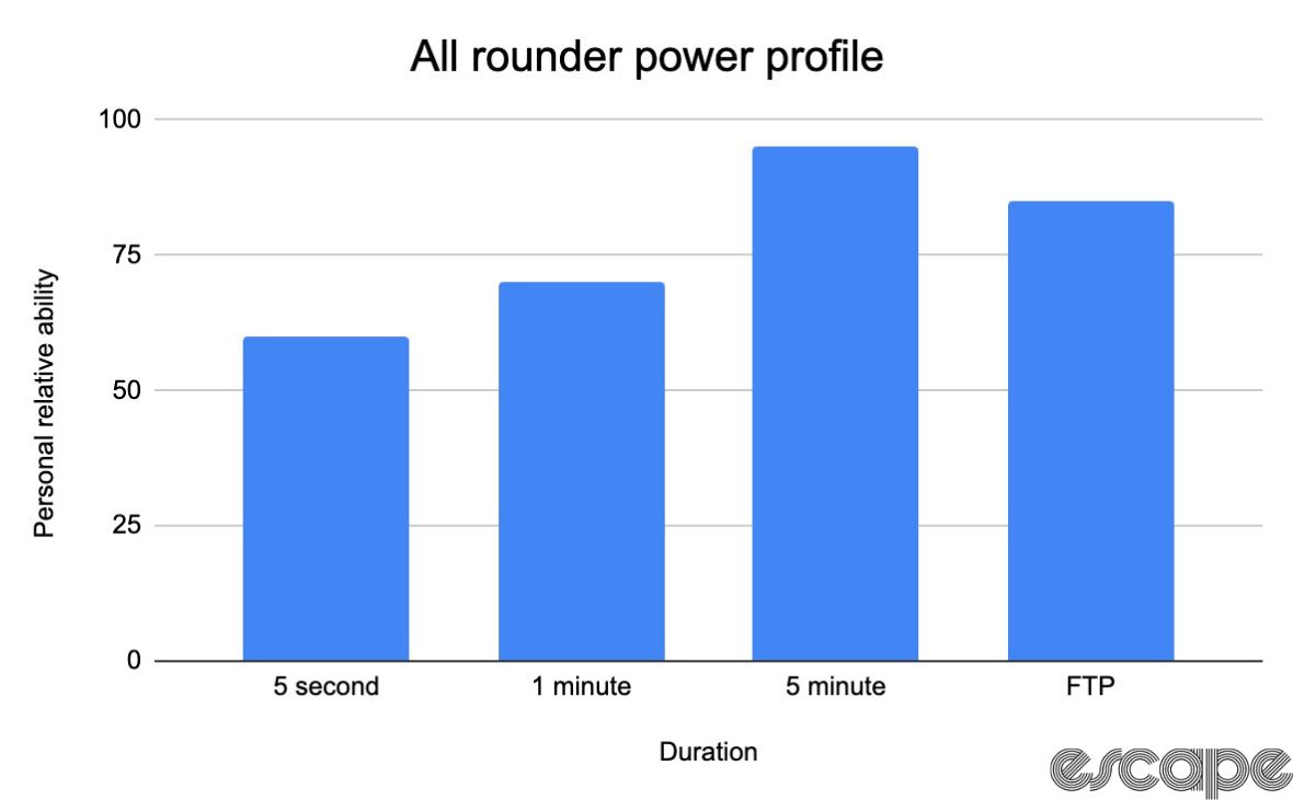
Once you have an idea of your power curve it can be used to define your riding style which can be useful in races when strategising the best tactics for your abilities.
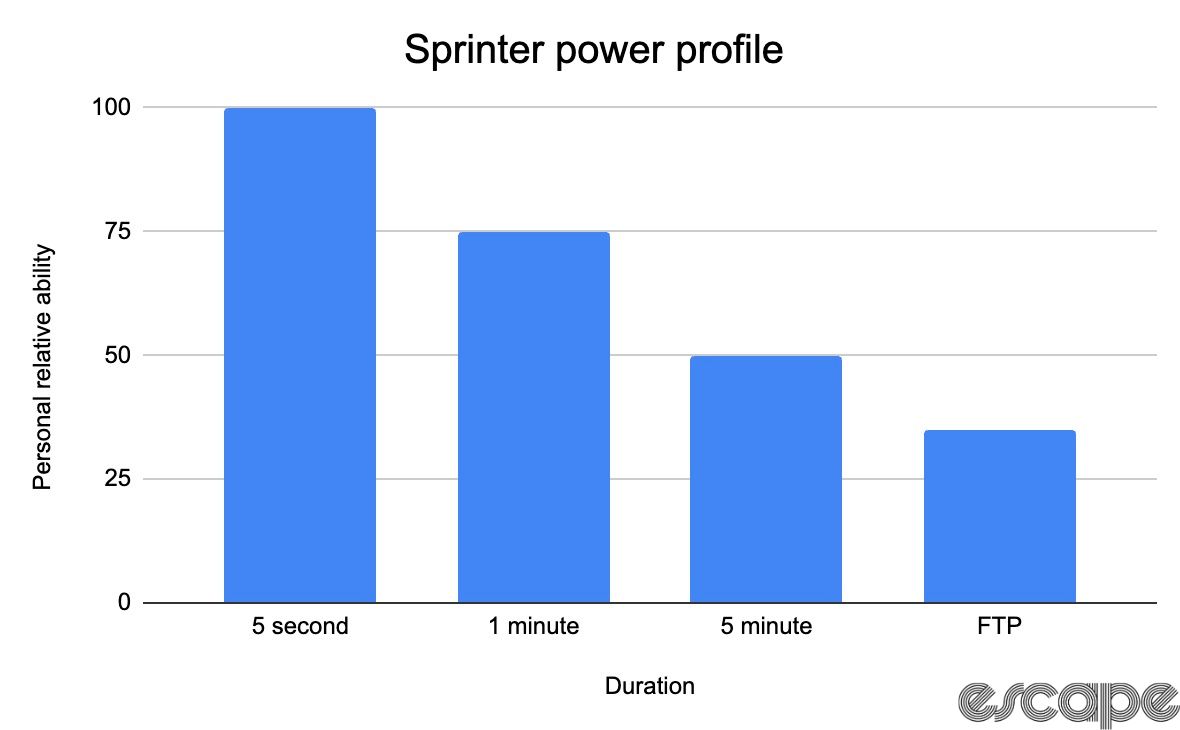
Sprinters will have high power outputs on the short-duration side of the curve but lower relative outputs for longer durations. This is typically the opposite of what is seen for time-trialists or breakaway specialists who might have a flatter curve, indicating they can sustain high power over longer durations but struggle to ramp things up at higher intensities. All-rounders like Tadej Pogačar and Wout van Aert have a balanced power curve with no pronounced weak point.
By comparing your power curve over time it is possible to monitor your broader cycling ability and capture improvements in fitness beyond just FTP. Analysing your power curve is the easiest way to ensure that specific and targeted training is effective.
Your power curve can also be a great pacing tool for longer events. If you have a 100-mile (161 km) event it can be hard to work out what power you should be looking to ride at to prevent a blow-up 80 miles (129 km) in. Having your power curve display your best power over all durations helps to put you in the right ballpark for pacing. From here you can tweak things according to feel on the day.
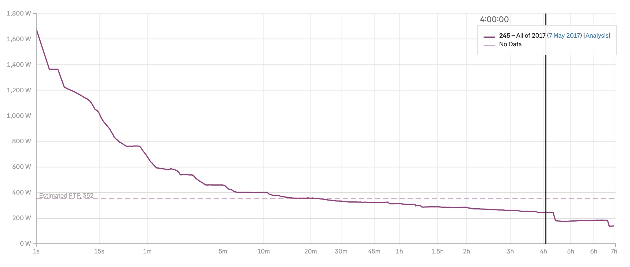
The main benefit of understanding your power curve is that it provides insight below your FTP or critical power value. This differs from the critical power model which only functions for power outputs above your critical power. So long as you have ridden for the duration you want to analyse it will be part of your power curve.
Conclusion
Understanding and analysing your power data can significantly enhance your performance and training. Beyond FTP, understanding normalized power, intensity factor, and training stress score allows you to assess the physiological demands of your rides. This provides insight into your progress and the effectiveness of your training. While FTP is a fundamental metric, the additional context these data points offer provides a clearer picture of the impact and effects of variable rides. Beyond those metrics, power meters with more advanced tools like Pedal Centre Offset can help with bike fit and efficiency gains.
Lastly, your power curve can offer deeper insights into your riding style. By regularly analysing your power curve, you can identify your strengths and weaknesses, strategise for races, and ensure that your training is specific and effective. Ultimately, the data collected during your rides offers a powerful way to track progress, optimise performance, and stay on track.
In the next instalment of ‘An Introductory Guide to Power,’ we take a closer look at power zones, what they mean, what models exist, and how they can transform the effectiveness of your training.
Did we do a good job with this story?

