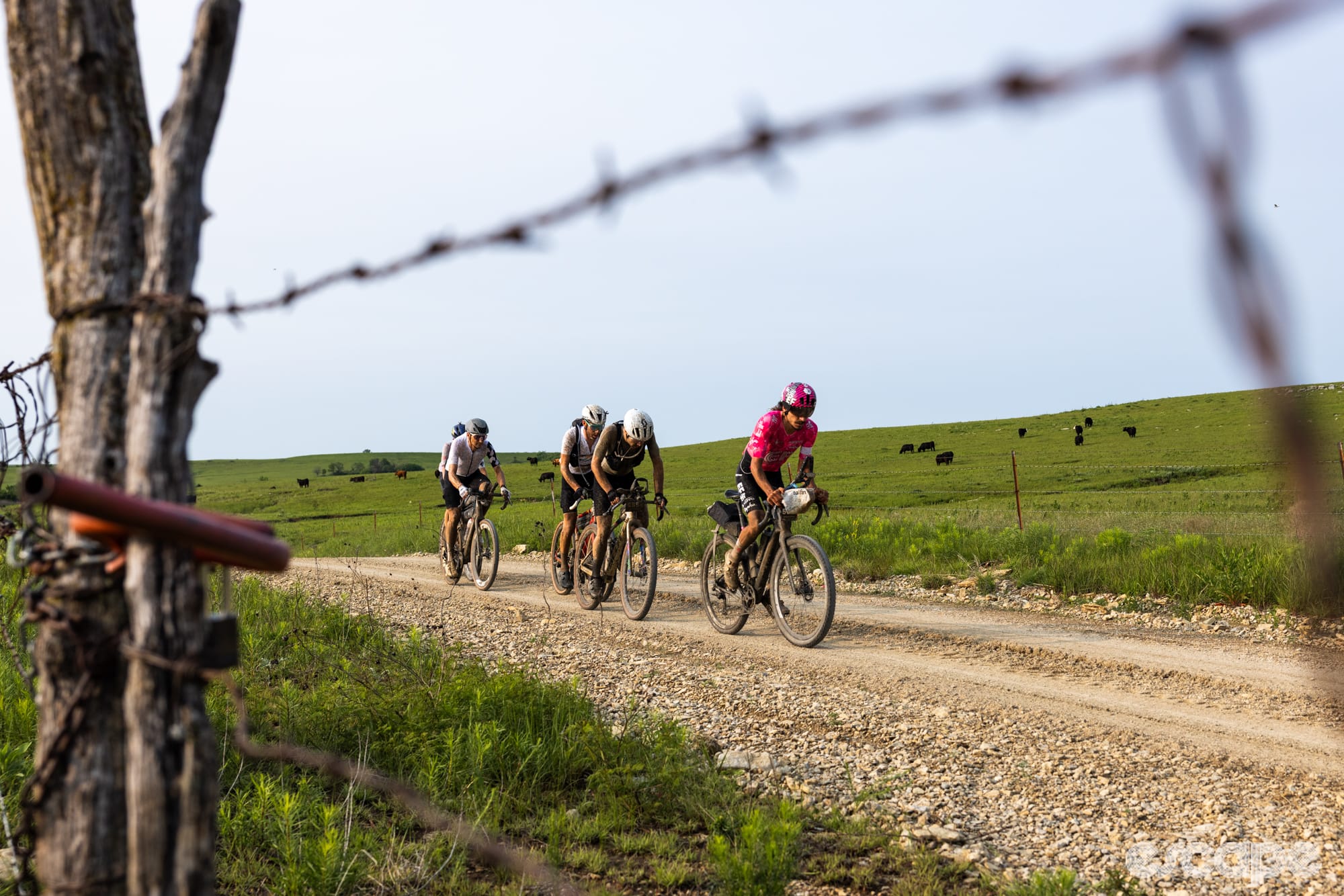
I used to love the idea of tech, stats, power, data ... My cycling obsession was born in notebooks full of numbers as my rugby-playing legs turned to pedalling pistons, and I went from a couple of laps of the village to several hours on the bike. Before long I found Strava and online training analytics, but 10 years later, those days are long gone and I believe I’m more in line with the bewilderingly elastic ‘spirit of gravel’ than the weight weenies of road cycling. My use of tech these days is more for mapping and safety than recording, and I long ago gave up on anything close to marginal gains.
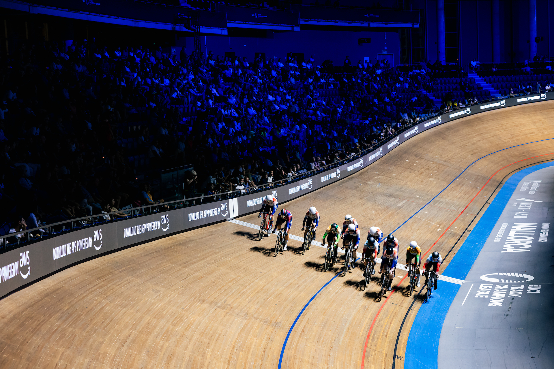
All that is to say that, while I love track cycling, I was reluctant to fully engage with everything the UCI Track Champions League offers. The series is now in its third season, and with each passing year the emphasis on data seems to have become greater, and this year the companion app is even more wrapped up in the live racing. As a rule, I don’t like filling my phone up with apps, but I was persuaded – by a few Escape Collective members over on Discord – to download this one prior to Saturday’s round 1 in Palma, Mallorca, and I have to admit that it did enhance my experience.
First impression: it’s neat. If you’ve seen any of the coverage or even just a few images of the TCL, you’ll know the visual identity is thoroughly considered and consistent - the event is an almost literal traveling circus with all the screens, LED lighting, speakers, etc. traveling between velodromes each week. The app is very much in keeping with that.

Each round starts with the unusual three-up individual sprint heats, the most business-like and controlled part of the evening, and a good time to begin fiddling around the app as the top sprinters sorted themselves out for the rest of the evening.
One unfortunate kink is that the app and the coverage are a little out of sync. It's understandable and not unusual when you're dealing with live sport and the internet, but if you’re watching just three laps of top-tier track sprinting, it’s over pretty quick, so by the time you look down to see what power Harrie Lavreysen is laying down, the race IRL is already over and all you see are the results.
It was much easier during the endurance events for that reason, and I particularly liked the 'live video' option which included sound so you could hear Mark Stewart hollering at a rival to jolly well get in line, or observe Lily Williams adhered to Katie Archibald’s wheel - a good place to be; these two shared the spoils on the night with Scratch and Elimination victory respectively - alongside all their live heart rate, power, cadence and speed data. It was aggressive, and noisy, and somehow claustrophobic.

Then I found the novelty feature that is equal parts brilliant and weird.
From the live race page or the dedicated rider section of the app, you can focus in on individual riders, and that’s where you find a curious interactive option: ‘feel heartbeat’. Click and your phone begins to vibrate in time with the selected rider’s pulse. A little odd. I can’t imagine I’ll try it again having tested the feature once, though it would be a fun novelty to show someone else - I can see why it’s there.
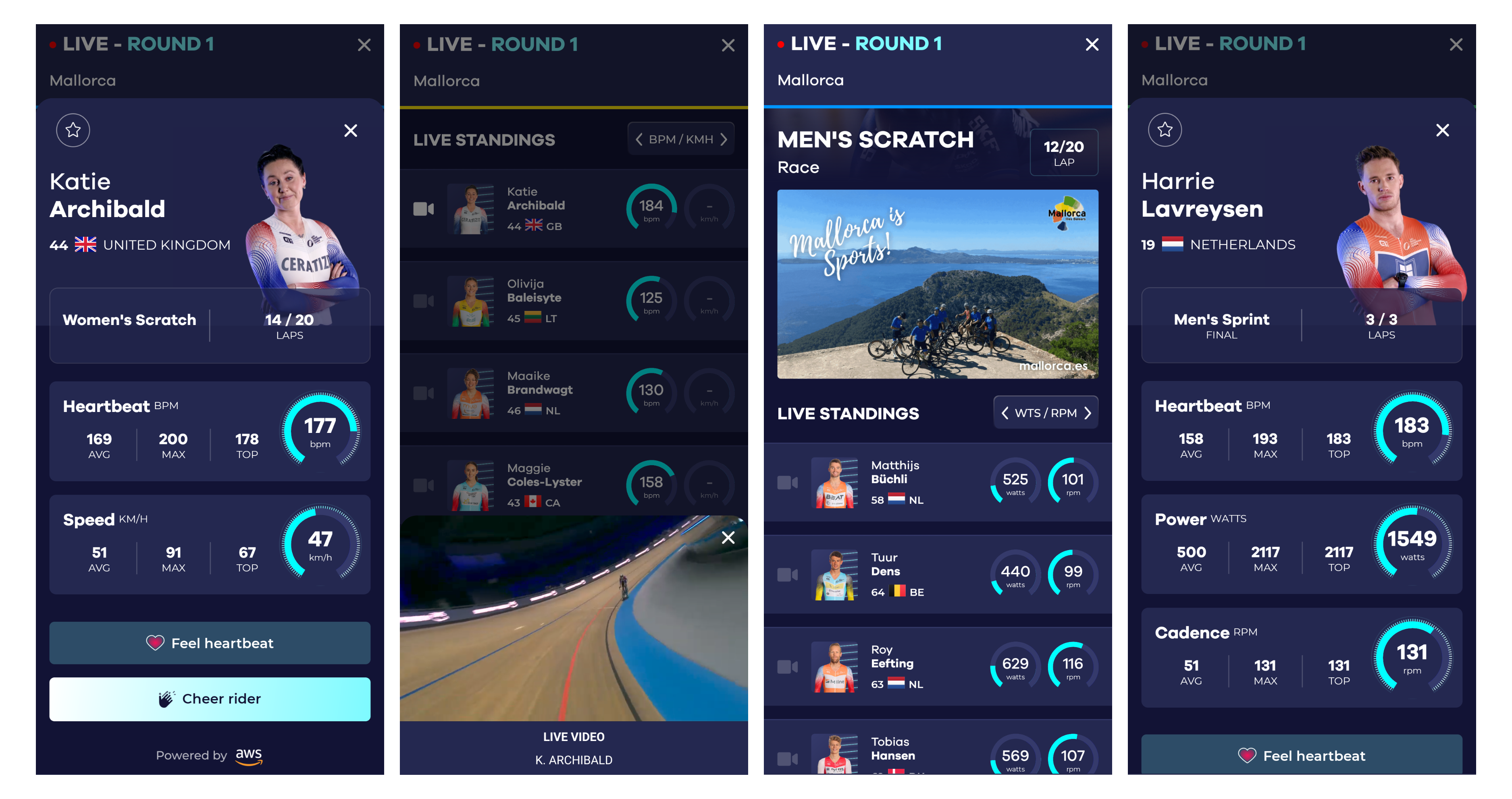
A real strength of the app and the data it provides is the comparison between riders. There's a literal 'head-to-head' feature on the home page that takes you to a kind of Top Trumps page listing age, top HR, power, and cadence which is something to look at, but the live, more organic comparison afforded by the race hub is where things get interesting. See who's working hard, who kicks first, even an insight into power-to-weight ratio and comparative exertion in the same sprint or Scratch breakaway, etc.
It doesn't make the racing more exciting - the riders themselves need no help in that regard - but who doesn't love a bit of behind-the-scenes action?
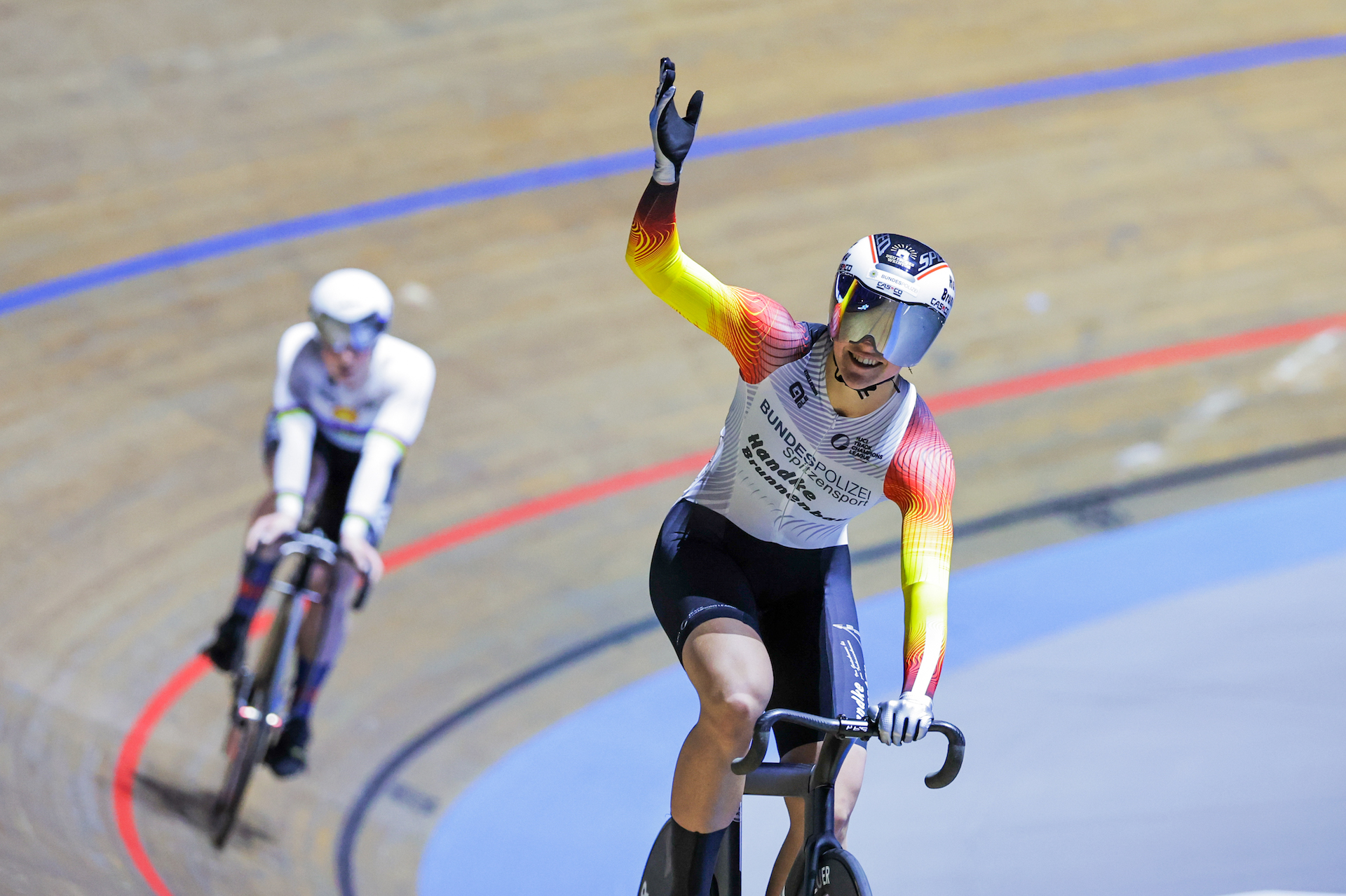
There were a couple of glitches on the app - it crashed a few times and all male riders from both categories were shown as racing the Elimination (that’s something I’d like to see) - but the app held its own on its season debut. It's not a crucial facet of the coverage and I can’t promise I’ll use it every week, but it does add something and I’m sure it will appeal to plenty of track cycling fans old and new.
Did we do a good job with this story?

