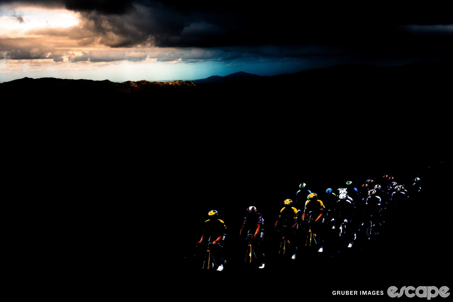
The Tour de France is the biggest race of the year, and everyone’s keen to look their best for the occasion. For many teams, it’s an opportunity for a new kit – either to make themselves feel extra fancy, or in some cases, because they're forced to, so they don't look like the leader’s yellow jersey.
This year, there’ll be eight nine new kits on the start-line (... we think) – some a result of sponsor changes, others toning down the yellow, and others just because they can. To assist your rider-spotting this July, we’ve compiled them here in one handy spot.
Bora-Hansgrohe

The German team has skirted colour-based conflict over the years by being a different shade of green to the spinter’s jersey, but – not wanting to be left out of the fun – have shaken things up with new kits regardless. Last year’s special edition Tour kit was a largely white affair; this year they’ve kept it green, got rid of the coloured blocks and subtly hidden a text motif in the background. That text is the names of all the Bora Boys that have ridden at the Tour over the last decade, with “each name carr[ying] the weight of countless hours of training, countless miles conquered and the passion that drives our team.”
On the back is the team’s ‘Band of Brothers’ catchphrase, which is reminiscent of Soudal Quick-Step’s ‘Wolfpack’ but with slightly less violent a waft of Lynx/Axe body spray on the breeze.
Jumbo-Visma

The team of defending champion Jonas Vingegaard has an extremely yellow kit most of the year round, so it’s little surprise that they get the UCI nudge to make some changes each July. Last year’s smudgy design was based on the artwork of the Dutch Masters, whereas this year’s is representative of “the power of dreams”. The team’s most baffling offering in this theme was a terrifying Jonas Vingegaard AI video, but they’ve been a bit more subdued in the follow-up.
The kit has more black than yellow, stylised constellations everywhere, and – on each rider’s jersey – a separate motif celebrating career highlights. It's produced in collaboration with a Dutch theme park, with the collection named after a cycling-themed merry-go-round called The Vélodrome. As bonus points, if you're a Jumbo-Visma superfan and you're buying your The Vélodrome jersey, you can also pick up a children's book called 'Look, I can do it!' – which features a QR code to get narration in assorted languages by Wout Van Aert, Jonas Vingegaard and others.
In conclusion – fine jersey; something for the kids; AI will still end us all.
Bahrain Victorious

Bahrain Victorious were one of the first cabs off the rank, announcing their striking white/teal/gold kit a month ago. It’s a big shake-up from their typical red/orange/black, and according to the team, it’s an “homage to Bahrain’s rich pearling history." Carrying on in that informational vein, Bahrain Victorious would like you to know that the country is "known as the 'Pearl of the Gulf'" and that "Bahrain has a great heritage rooted in the thriving pearling industry that flourished in the region."
That little Middle Eastern economic history primer is reflected in the team’s bikes, kits and helmets, with the teal representing the waters of the sea, and the gold and white symbolising the “shimmering glow” of the pearls themselves. The sponsors stay the same, which means that there’ll still be a big ‘Business Friendly Bahrain’ on the leg (although the business that Bahrain is mostly friendly toward nowadays is fossil fuels rather than aquatic treasures.)
Anyway. Pretty good kit! Better than the usual one!
DSM-Firmenich

Team DSM has changed names just in time for the Tour, and although their new kit is not a special edition jersey, it’ll be among its first big public outings. It looks almost exactly the same as the old Team DSM kit, but it says DSM-Firmenich on it (technically stylised dsm-firmenich, but I’m not going to do that). Firmenich is a Swiss business that is “the world's largest privately-owned fragrance and taste company”, and they land on the DSM kit as a result of a merger between the two companies. Don’t worry, you can still get your DSM Yolkfans – you’ll just be able to lightly perfume them now, as well.
The new logo across the chest is in a series of white circles, and it actually looks a lot better than the flower or whatever it was that was on there before. The whole thing is navy rather than black, too. Not bad.
Movistar

Not a team that I’d ever thought of as having much of a social conscience, Movistar is rolling out a new kit they’re calling ‘The Iceberg’ for the Tour de France. Navy blue is out in favour of a mostly white jersey that transitions to blue as it approaches the knicks.
Movistar’s made a big fuss of the environmental goals of the kit, which is a bid to raise awareness of the troubles befalling the world’s oceans. For example, icebergs melting into the sea because of accumulating commercial activities such as designing special kits just for one race.
Wearing a less cynical set of glasses, the team’s kit manufacturer, Gobik, has made the kit of a minimum 60% recycled plastics, and the jerseys will be signed and auctioned (and hopefully, washed) after the race as a fundraiser for environmental causes. So I’ll let them off the hook. Just.
Uno-X Pro Cycling

The extremely Scandinavian team Uno-X have a big few weeks ahead of them: the team’s first ever Tour de France, its first ever Grand Tour, and – for five out of eight riders – their Grand Tour debut, with Alexander Kristoff contributing the bulk of the team’s experience in this regard.
The big change on the kit is that instead of being mostly yellow (with a bit of red), it’s now mostly red (with a bit of yellow). This isn’t just for style reasons; the team’s marketing manager has told Norwegian media that the UCI forced the change to avoid a clash with the yellow jersey.
There’s a change on the sponsor front, too, with the supermarket chain Rema 1000 coming on board. How exciting this will be to you depends on how much you like the sound of a supermarket that is (slightly) less ruinously expensive than the others in Norway, which has enormous frozen salmon that you can sneak into your friends’ little wheelie baskets as a prank. For me, this is about as exciting a sponsor announcement as you can get.
Astana Qazaqstan

For the 2023 season, Astana Qazaqstan have added a sentimental sprint favourite in Mark Cavendish, made some surprising moves in the sponsorship space, and – for the Tour de France – changed kits entirely, even though their original one was pretty good already.
Happily, the special-edition Tour kit is also quite a looker, with a marbled gold and blue design that the team describes as having a “unique charm … similar to the veins of mineral stones,” which is a reference to Kazakhstan’s natural resources. The blue apparently represents the sky, the gold represents the sun, and with their powers combined, they represent the flag of Kazakhstan.
Also new to the jersey are a couple of new sponsors – KAZ Minerals (hence all the mineral talk) and Freedom Broker, a Kazakh-based “systemic investment company of international level, represented in 8 countries”.
Lidl-Trek
At time of writing there’s a lidl bit of intrigue remaining in the kit lineups at the race, with the squad formerly known as Trek-Segafredo yet to reveal their full kit. With the departure of the coffee brand Segafredo, German supermarket chain Lidl have stepped in – with a radically different palette forcing a ground-up redesign.
There have been a few hints about what’s to come, including the above teaser post that basically filled in the blanks, but for the time being, we’re not sure exactly how much the team will look like they’re all Romanian national champions. For now, we’ll say 70%. Could well be more.
Update 28 June:
It's here! Please find below a picture of Mads Pedersen ripping his way into the kit reveal on a town bike. The Lidl logo is a bit clunky for my tastes, but all in all, quite cheerful. I'll revise my 'Romanian champion' rating down to 50%.

Israel-Premier Tech

A late arrival to this article, Israel-Premier Tech – forever fond of a change-up – announced a new kit late on Wednesday. Unlike their Giro kit, which was a celebration of wine (or, more accurately, their Italian wine sponsor), this time around it's an all-Israeli affair designed to "[highlight] the partnership with the country's Ministry of Tourism, who wishes to present Israel as a tourist destination with many destinations to discover."
There may indeed be many destinations to discover in Israel, but the kit wants you to focus on just one tourist attraction: the 1,000+ kilometre walking and cycling path "from Kibbutz Dan in the north to Eilat in the south". There's symbolism in each colour on the jersey, the team explained in a press release. "The white stripe representing the mountains and Mount Hermon in the north, the blue stripe symbolising the coast of Israel and the orange stripe representing the desert in the south."
It's quite a red-orange, which makes it one of the most French-looking kit in the Frenchest of Grand Tours. Does it also look a lot like Groupama-FDJ's old kit? Yes! Will that be confusing? Probably!
Is that it?
Who knows. Israel-Premier Tech's very late arrival has made me suspicious that the kit reveals may not be over yet. If anyone's going to pull something out of the bag late, my money's on EF Education-Easypost at the team presentation on Friday night. We shall see!
Did we do a good job with this story?