
Welcome to 2024 Peloton Fashion Week.
We are just barely starting what will undoubtedly be a pivotal season of women's cycling (for a multitude of reasons: changes to TV rights, the Olympics, the growing prestige of races, the continued professionalization of the teams, etc.) and it's more important than ever to stand out amongst the crowd. Unlike seasons past, it seems the kit designers took note of that imperative for 2024 (no shade, kit design is a hard job). Remember in 2022 when everyone wore pink or beachy fade? Those days are behind us.
The women's peloton this year will be one of overwhelming colour, especially when Lifeplus-Wahoo lines up. From the primary colour situation that is Lidl-Trek and the whimsical colour explosion that is Canyon–SRAM to the incredibly dull red of Roland, it's going to be easier than ever for your favourite commentators to distinguish who is in the break.
So, with a ton of judgment and personal feelings involved, here are my takes on the 2024 peloton fashion. The good, the bad, and the ones we really need to see in person to understand, apparently.
The top three
Lidl-Trek
Business in the front. Party in the back.

Since Lidl-Trek changed their kit halfway through last season this attack of colour didn't make it onto the start of the year kit review (I guess last January we didn't have one as Escape Collective didn't exist. Semantics). But now is the chance for me to say how great it is. Viewers will never, ever, not know if a Lidl-Trek rider is in the lead group. How could you miss that massive Lidl logo right between the shoulder blades? It’s bold, it’s loud, it’s a lot. In the best way.
This kit is a 9/10 for me, one point docked because they really could have leaned harder into the primary colours, and they better do so in the future. Isn't going all in in cycling kind of the point? All in on the kit, all in on the road. That's what I want to see from Lidl-Trek in future.

Canyon-SRAM
I had a fear that Canyon-SRAM wouldn't change their kit for the 2024 season, and as much as I loved the pink weather-themed (I think) one, there should be a rule that teams have to change their kit every 2-3 years. For fun. So when the team subtly teased a new look, my interest was piqued, and boy did they deliver.

What's great about this kit is that it has a lot of fun on the front panel while keeping the sleeves different enough that they don't stumble into SD Worx territory. Even so, there is so much going on, between the small patches of colour – like the green on the hip – to offsetting everything going on up top with super simple bottoms.
According to the team, the look is "melody in motion," inspired by the ever-changing rhythm of the race. They're even named the kit; Harmonic Rift. And all of that is great, but the fact that we get to look at this beauty for at least a year is music to my ears (eyes?).

This kit is so good, but what would we expect from a team that constantly pushes the line of what a professional sports team can wear?
FDJ-Suez
FDJ-Suez always has a good kit. It's nothing crazy, but at this point the variations on red and blue are recognizable, they are classic, and they are FDJ-Suez.

At first glance, you might think the French team is wearing the same jersey as last year, but the beauty is in the detail. Where last year's kit was a red left shoulder with a solid blue body that faded to black, this year the team threw a smoke effect-looking design into the red, adding depth to their former design. They did the same with the blue, adding some lighter tones so there's actually a lot going on, without it being in your face.
When it was first announced I didn't think too much about this kit, but in writing this piece I became convinced it is one of the best in the peloton. It's loud without being obnoxious, it's classic without holding too tightly to tradition. It is a kit worthy of a WorldTour team. Look a little longer, and I know you'll agree.
The good
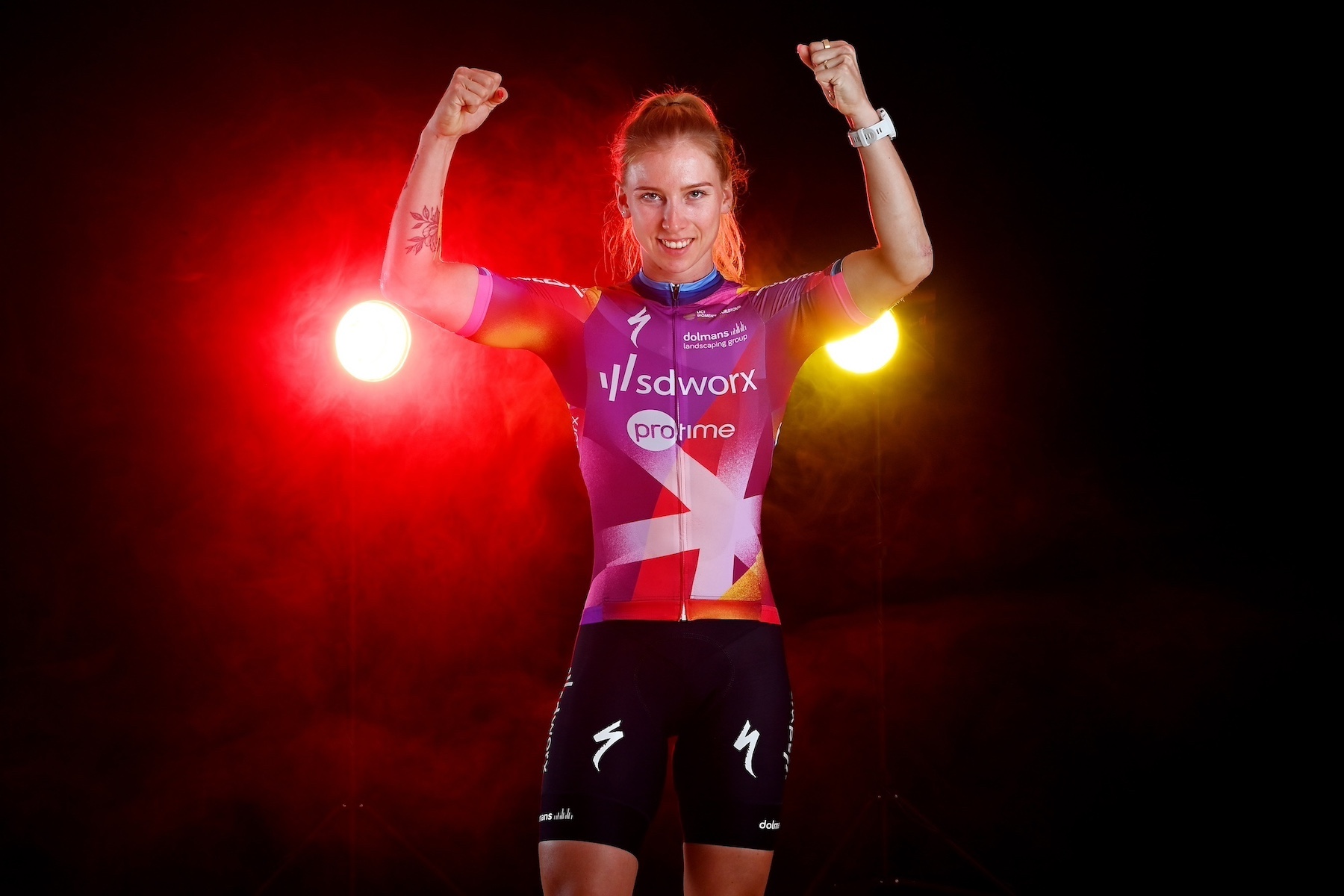
SD Worx
Similar to their 2023 kit, SD Worx added even more flair to their look for the new year for a subtle departure. Even though only two-thirds of its members will be wearing the team kit, those who do get to pull it on will be as easily recognizable as their national (and European, and World) Champion teammates. And of course, Lorena Wiebes will likely take another jaw-dropping number of wins in this kit before swapping it for the Dutch road champ (again) or the World champ or ... gold. Is the sky above you? Will Lorena Wiebes win a ton of bike races? Both are a firm yes.

Last year the jersey had a purply-pink line down the centre that faded into red via orange, but this year the purple, red, yellow, pink and orange are blocked a bit more, there is both more chaos and also more order, less fade and a clearer plan. And like Lidl-Trek, they've opted to make the back even easier to spot.

DSM Firmenich-PostNL
When this kit first dropped I didn't know what to feel. I didn't know what I was looking at. But after further study, and having seen it in action in Australia, I've decided this kit is a great change for DSM Firmenich-PostNL. It's a team that has for so long coloured within the lines, but over the last two years we have watched a whole new version of the Dutch squad develop. After the departure of Liane Lippert, Floortje Mackaij, and Lorena Wiebes, the team had to look to their young riders to step up, and they did.

When the team first formed they were known for their overly strict, no-bending approach to their athletes. Everything was internal, everything controlled. The kit was just that, even when the team was under Sunweb's sponsorship, it was as basic as basic can get, and no fun was had at all in that design room.
This new version of the team is fun-loving and moves with the flow of the races. Take Classic Brugge-De Panne, when a bit of chaos took the team's sprinter Charlotte Kool out of contention and Pfeiffer Georgi and Megan Jastrab had to adjust the plan. They were successful, and it wasn't just a fantastic win, it was a sign of how changes within the team were helping the next generation to thrive.
Now, with a pop of orange thanks to new sponsor PostNL that will make sure you don't miss Kool even when she's nearing the speed of light, the team is entering their "loose" era. I still don't know how I feel about the design from an aesthetic perspective, but I am here for the changes that the whole thing entails.
Uno-X Mobility
During the Tour de France Femmes avec Zwift Uno-X swapped out their mostly yellow jersey for a mostly red number and I guess they liked it because they're going to be wearing it for the 2024 season. It's a simple look, but it won’t get lost in the crowd. There are not a ton of sponsors cluttering up the front or back. I don't have a better analysis of this kit, I just like it. I like how easy it is.

When it comes to national champions you can't miss that the team claims the Danish (Rebecca Koerner), Norwegian (Susanne Andersen), and Finnish (Anniina Ahtosalo) champs. They get extra kudos for that.

The fine
Movistar
Over the years Movistar continues to experiment with what they can do with the colour blue. Every year they make slight changes and fluctuations between blue and black, with an occasional special-edition white thrown in for a bit of a change.
This year's jersey hints back to the early years of the team, albeit a bit darker blue than those first years, the blue jersey paired with darker bibs is somewhat similar to when the team was formed in 2018.

Similar to Canyon-SRAM, the Movistar kit is inspired by rhythm, although their launch video was a bit all over the place. There was city traffic at night, weather, wild horses, birds?, brains? It was a lot. Points were deducted because even with a full team of women they failed to include a single one in the launch video.
The bottom half of the jersey is slightly similar to FDJ-Suez without being as compelling as what the French team put forward. The whole look is alright; it's nothing groundbreaking but it's not offensive to look at. It's a heck of a lot better than their 2022 look.
Human Powered Health
A team worth watching this year, Human Powered Health have shed their men's outfit to focus solely on their women's WorldTour team, gaining Factor as a bike sponsor along the way. The team has big ambitions for the future, but, likely, we will still see a whole lot of their orange and purple jersey in breakaways, throwing everything at the wall.

The kit is really similar to their 2022 look, with a purple splash through the centre and orange on both sides. In 2023 they had a full fade from orange to purple, so only the right shoulder was orange, but this year they've taken a look back and dragged what worked well to their new future as a women-only team.
In terms of standing out, it will be hard to miss those orange Smith helmets.
Visma-Lease a Bike
Visma-Lease a Bike (formerly Jumbo-Visma) is leaning even more into simplicity. It's a team that doesn't deal in frills and flash. They are straightforward. Simple. They kept the hints at bees with the geometric honeycomb pattern at the bottom of the jersey, but did away with the big black band that usually underlays the logos across the chest.

The kit would possibly be considered boring but it stands out in the peloton. It's the only one of its kind. They are the only team in the WorldTour that have gone full gas with the color yellow.
AG Insurance-Soudal
Dang, the further into this list we go the more blue we've got. The AG Insurance-Soudal kit is pretty easy. Dark blue bibs with a slightly lighter top. Logos on the chest are atop a white band that fades slightly into the blue, and that's about the only "effect" we've got on the whole thing. That and the slight detailing on the sleeves where the Soudal logo is.

Look, every kit doesn't have to be revolutionary. It's totally fine to have an "ok" kit. Not everyone can be Canyon-SRAM, and if they were the peloton would be a hard thing to look at. We need the AG Insurance-Soudals of the world to keep us in check.
UAE Team ADQ
UAE Team ADQ will be decked in the same kit they wore in 2023. It's gorgeous, I like it. The colours are beautiful, offset by black bibs. All in all, it's one that I am not sad to have to look at for another year.

UAE Team ADQ will also keep their Colnago bikes, a big win. Those things are stunning.
The not-great
Fenix-Deceuninck
Another team that is sticking to their 2023 kit is Fenix-Deceuninck. I guess there's not much to dislike about this one. It's just blue with some bands around the stomach and arms. There are logos everywhere, which isn't great, but the team needs to make money somehow.
It's not terrible. It's just there … like pack fodder. Fortunately for us, the kit design doesn’t overflow into the team's ethos. Fenix-Deceuninck has an attack first, ask questions later approach to racing, a strategy that won them a stage of the Tour de France Femmes avec Zwift last year. Still, I’d like to see a little more effort from a WorldTour team.
Liv AlUla Jayco
According to Matt de Neef, this one is better in person, but as I've yet to see it IRL I am going off what I've seen so far. And what I've seen is a harsh combination of panels that break up the body in a weird way. It’s something a student would design their first day using Illustrator.
Once again they've decided to make the women's kit purple and the men's blue, but this time that can be forgiven, with Liv stepping in as a new title sponsor. I don't know, this is one I'll clearly have to see in person to understand.
The bikes are at least pretty interesting to look at.
Roland
If there was one word I would use to describe the new Roland kit it's lazy. Last year, with Israel-Premier Tech as a sponsor, the kit was relatively decent. This year they've reverted back to the red jersey, blue bibs that the team wore pre-IPT. There is almost nothing to say about this one. They put about as much effort into the kit as they have making the team worthy of their WorldTour license. Is that harsh? Yeah, but dropping your roster from 17 to 12 riders isn't an encouraging sign for a team that's clearly on relegation watch.
Ceratizit-WNT
Not as bad as Roland's kit, but just as simple, the Ceratizit-WNT look is similar to their long-running red/blue combo. New to the WorldTour, you'd think they would want to really spice things up, show off that they'd finally, after years of being Conti level, made that jump. Instead, they went with what they know; red sleeves, blue body, blue bibs.
There is some design on the blue of the jersey, faint enough that you really need to look closely to see it. But I can't decide if that makes the whole thing better or worse.
Continental teams that understood the assignment
Lifeplus-Wahoo
I can't stop thinking about the new kit of Lifeplus-Wahoo. Thanks to their new partnership with MAAP, the British team has combined their love of colour and MAAP's design team to create the most stunning team kit I've ever seen. Heck, I even cracked my wallet to buy a jersey, that's how much I love this kit.

They went with non-traditional colours for the jersey and colours that are super "in" right now. Mint green and lavender purple combine in the perfect way, flowing with each other, loud and proud. Good luck keeping your jaw from dropping if you have the absolute privilege of seeing this jersey in the wild. Instead of the usual black bibs to go with a statement upper-body piece, the bibs are dark green, a forest green. It works so well with the colours of the jersey, neither overpowering nor bringing down the look with a plain base.
This kit is perfection. I have no notes. If Lifeplus-Wahoo was a WorldTeam this article would have been "Lifeplus-Wahoo ... and the rest."
EF Education-Cannondale
The new EF Education-Cannondale team may have left TIBCO-SVB behind but as it's now formally part of the men's outfit it's no surprise that their 2024 kit is a good one. Perhaps not as incredible as 2022, but still, the bright pink will be hard to ignore in the peloton.
It’s a team that wants to be seen. They’ve been honest with their goals for the future: to join the WorldTour and to win the Tour de France Femmes. With the roster they’ve put together the first goal is all but assured, especially with the way they’ve started their European season.

The whole idea behind the team is to cultivate a positive attitude, and the kit embodies joy, explosiveness, and electicity. It’s a look that every rider will be proud to pull on all season long. The women will never struggle to find each other in the bunch, and trust me that makes a difference when you’re suffering in the tail end of a race.
No real losers
Overall the women’s peloton is stunning this year. Most of the teams have seen the importance of a buzzworthy kit and taken that to heart giving us one of the most colorful pelotons in years. Even the kits that aren’t as easy on the eyes don’t blend in, and that’s great for viewers of a sport that takes place on open roads with never ending scenery at breakneck speeds. You want to be able to quickly and accurately spot who is in a move from a helicopter and for the vast majority of the peloton, that will be doable.
So with the Classics approaching, we can rest easy knowing once the peloton hits the cobbles we will be able to see which teams have come to challenge SD Worx-Protime, and which teams can’t quite make the cut.
Did we do a good job with this story?